1. Do not use the outline of a basketball for any of your jump circles. This looks childish. Of course Baylor isn't alone in this...
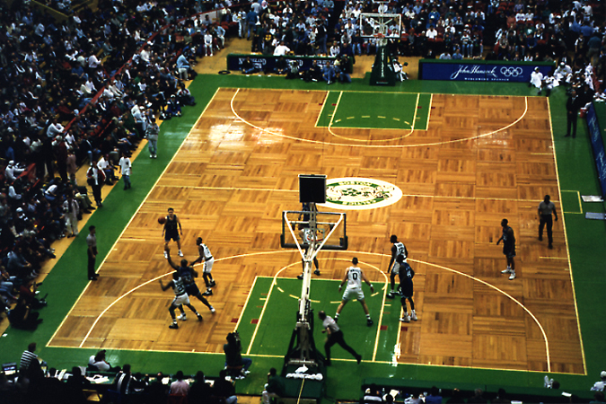
Yuck..and this is where Jordan had to play. Center Court is disgusting. And how many Bulls' heads do they need on the floor? 5??!!?? Why stop there? Why not just line the entire playing area with them.
2. Definitely paint the lane. But dear God, only use ONE COLOR!
3. ONLY paint the lane (out of bounds is fine too), not this:

K-State used to have a variation of this paint job and it looked even worse. Just imagine all of that purple. --shudder--
4. If you are big time program, there is no reason to have other sport's boundary lines on your court. Build that non-revenue producing ("Olympic sports") another home.
5. No advertisements on the floor. I'm looking at you, Texas Tech. Even though I can't find a picture of it, I know what I've seen on the television and that has NEVER let me down.
6. Big logos at center court are a must, but this can be overdone very quickly:
The Jayhawk at Allen Fieldhouse was close to pushing this too far, but its fine considering its just one big thing. The Aggies have 3 gigantic things: Outline of the State, a T and a star. One thing I do know about Texas is that they will put that damn star on anything they can. So special..
They did have one thing right, however....
7. Parque floors are awesome. Hands down.

and
That's all I have for now. Any others?


3 comments:
You're right about parque floors.
I think that the Jayhawk is perfect size.
KSU's would be alright if they removed the "KANSAS STATE" wording at center court.
Proof of the TTU advertisement on the court (long url):
http://images.google.com/imgres?imgurl=http://4.bp.blogspot.com/_JDn-f0oI9fM/RZVJwfS_SrI/AAAAAAAAADI/LSyae7FgQPE/s400/dickieV.jpg&imgrefurl=http://commcognition.blogspot.com/2006/12/three-point-clinic-keeps-880-waiting.html&h=317&w=400&sz=30&hl=en&start=199&um=1&tbnid=1Ui-YVvOpcmULM:&tbnh=98&tbnw=124&prev=/images%3Fq%3D%2522united%2Bspirit%2Barena%2522%26start%3D198%26ndsp%3D18%26um%3D1%26hl%3Den%26safe%3Doff%26rls%3DGGLD,GGLD:2005-10,GGLD:en%26sa%3DN
what about the sedan gym with fucking looney tunes characters on it?
anonymous - chase
The looney tunes characters are no longer there.
Post a Comment